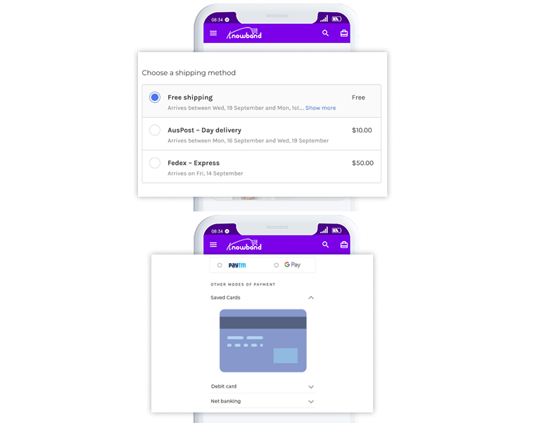
A checkout page is the one which turns all your efforts into the fruitful results. An optimized, fast loading checkout page can boost conversions and results in lesser cart abandonment. It is necessary to keep it simple and well organized to keep the user engaged.
Many shoppers do not like sharing card details on every website or they do not want to waste time filling out unnecessary information. You can provide them with various registration choices, easy signup, or log in with their existing social media accounts. Allow guest checkout on your one-page checkout for improving conversion rate.
In this article, you will come across some of the major distractions which you should remove while optimizing the checkout page.
Checkout out the addon from the below links:
PrestaShop One Page Checkout addon
OpenCart One Page Checkout extension
Magento One Page Checkout extension
Magento 2 One Page Checkout extension
1. Plan the page well:

It is essential to keep the design simple and sleek. Clear out unnecessary graphics from the One Page Checkout to eliminate the distraction. Knowband’s One Page Checkout addon offers three types of layouts hence admin can select any of the formats which suit better. The drags and drop functionality helps the store owner to change the positions of different sections like registration form, payment section, shipping section, etc.
2. Don’t give a last-minute offer:
Do not distract your customer by giving a last-minute offer. This can change their mind and drive them away from the checkout page to take the advantage of the offer you just made. Instead, allow present them discounts, coupons well before while they are shopping from the store to avoid last-minute deviation. Knowband’s One Page Checkout module has no coding customization options which can help you in adding extra fields.
3. Avoid recommending irrelevant products:
It is good to show automatic related products. I won’t suggest you to show any such thing when the user is about to finish the purchase. This will not only distract them but it might result in cart abandonment. You can show products which can be team upped with the product they are buying.
4. Ask only relevant information:
Skip not so important fields from the registration form. You can keep some of the fields as optional and some as mandatory. An inline validation error can be shown if the customer skips any mandatory field. Knowband’s One Page Checkout addon can help you with this. Add fewer fields in the registration form and remove unnecessary fields that can take customer’s extra time. Save their time and improve conversion rates.
5. Offer multiple payment gateways and shipping methods:

The Single Page Checkout addon allows the store owner to add several payment gateways. Not every customer likes giving details of their credit cards to re-share personal information on a website. You can add security badges to earn the trust of the customer. Many customers feel intimidated while sharing their credit card details. You can provide other choices that won’t drive them from the checkout page.
Not only the payment method but shipping methods can also become a reason for last-minute cart abandonment. Offer multiple shipping choices as no customer is the same and you can even charge extra for faster delivery to make some extra money.
Final Word:
Knowband’s One Page Checkout addon is the best solution for elimination all sorts of distractions from the checkout page. It will keep your customers engaged and allow them to finish the process quickly. I will highly recommend the store admins to replace the multi-page checkout with our One Page Checkout.


